Every so often, a cannabis brand enters the market with a level of clarity that is immediately recognizable. Before the product is opened, before the effect is experienced, there is already a sense that the company understands exactly what it wants to communicate. In a category where many launches still feel experimental — as if brands are testing identity in real time — Boho Euphorics arrives in New Jersey with something more difficult to manufacture: confidence.
That confidence becomes especially noticeable around 4/20, when the market tends to fill with louder promotions, limited releases, and seasonal attempts to capture attention. What tends to stand out during this moment, however, is not volume but precision. The strongest launches often share a certain restraint — an understanding that when a brand is fully considered, it does not need to over-explain itself.
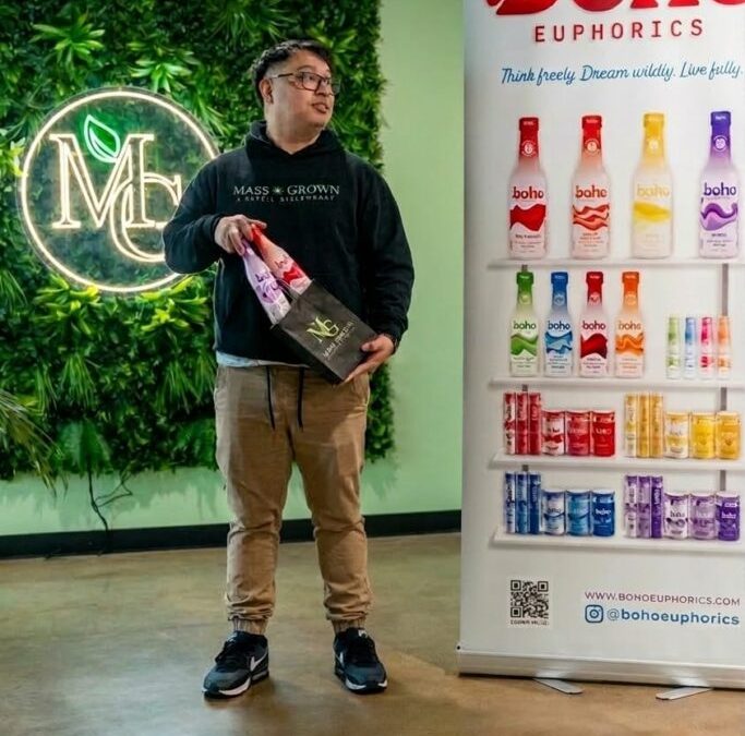
Boho carries that quality from the start. The packaging is immediate, polished, and modern, with a visual language that feels current without chasing trends too aggressively. There is color, but it is controlled. There is personality, but it remains refined. In a dispensary environment where products increasingly compete for seconds of visual attention, shelf presence has become part of product performance, and Boho understands that well.
“Our goal was to introduce meaningful innovation to the New Jersey cannabis market,” said David Hess, CEO of Boho Euphorics. “By launching the state’s first cannabis beverage and the first interactive pre-roll, and by becoming the first-ever KSA kosher-certified cannabis brand worldwide, we’re helping usher in this new era of cannabis normalization by delivering quality, flavor and choice — whether that’s a low-calorie drink, a potent syrup, a microdose spritz, or a pre-roll you can literally customize with a squeeze.”
Design That Understands the Modern Consumer
Cannabis consumers today are more visually selective than they were even a few years ago. Packaging has become part of trust, part of curiosity, and increasingly part of how brands signal quality before a purchase is made. The strongest companies now understand that presentation is no longer secondary to product — it is often the first proof that the product may be worth exploring.
Boho’s design language feels built around that reality. Nothing appears accidental. The brand communicates with enough personality to feel fresh, but avoids the clutter that often makes newer launches feel temporary. There is a maturity in the visual decisions that suggests long-term thinking rather than trend-driven design.
That matters because in cannabis, the difference between a product that feels collectible and one that feels disposable is often determined before the consumer even reaches the point of purchase.
Product Innovation Without Overcomplication
Where Boho becomes particularly interesting is that the product lineup supports the branding wi